Professor Rachel Norman and Dr Andy Hoyle, Faculty of Natural Sciences, University of Stirling
In the first of a two part lecture on COVID-19 and mathematical modelling, Professor Rachel Norman and Dr Andy Hoyle explore the role that mathematical modelling can plan in responding to epidemics, and how data from modelling can support efforts to flatten the curve of infection.
Watch the lecture online here or read the transcript below.
Hello, my name’s Rachel Norman and I work in the computer science and maths department at the University of Stirling. This is a talk that I’ve written with my colleague Andrew Hoyle. We both work in mathematical biology, in epidemiological modelling, so this is our research area.
What I want to do in this talk is look at why we would use mathematical models, look at simple models of disease spread and then think about how this relates to COVID. Really, what I want to explain to you is where this flattening of the COVID-19 curve came originally and how important mathematical modelling is in terms of understanding COVID dynamics.
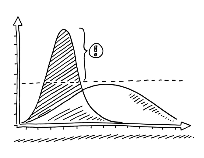
If you remember right back at the beginning of the outbreak, there was lots of talk of ‘flattening the curve, ’how do we flatten the curve, etc. The idea was that this red curve was what would happen if we didn’t have protective measures in place, so we would have a short term, very high number of infections. What we were aiming for was to reduce the peak number of infections and spread out over time so that we could stay below the health care system capacity. There’s been lots of epidemiological modellers in the news talking about this. So Neil Ferguson’s perhaps the most famous, called ‘Professor Lock Down’ – I’m sure he is delighted with that nickname. He works with Christl Donnelly and their group at Imperial and Roland Kao and Mark Woolhouse both from Edinburgh all of them are often on the news talking about this work and they work with large
teams of people across the UK. It’s a big collaborative project, trying to understand what’s going on. They’re building very complex and very detailed models.
The importance of modelling
I’m going to talk to you about something much simpler than that. First, I’m going to try and convince you that modelling with mathematics is really useful. First of all, people might be confused about what, why, and how you would model with mathematics. It’s exactly the same as modelling with things like Lego or Play-Doh. If you look at those Play-Doh pictures, hopefully you can tell that we’ve got a chick and a pig and a mouse and a cat and a dog, but you’ll see that they are obviously not very realistic. There’s just some key features in them that tell you what they are. So the way you distinguish a pig from a cat, for example, is that pig’s ears are slightly different and the nose is. For most of them, those are the only really different thing. If you look at them, all the heads of the same shape. The chicks colour probably helps with deciding it’s a chick. It’s obviously got wings, but none of them have got fur. None of them have got feathers and neither got legs or bodies. You can still tell what they are because what the modeller has done is find the key features of that animal and that allows you to identify them. And it’s the same with mathematics. You can’t include every element of reality in your model. It’s very difficult. But what you can do is try and pick the key features. That’s the real challenge in mathematical modelling is picking out. What are those key features that will allow you to describe the system you’re trying to model?
Why would you use mathematical models where experiments would obviously be much better at measuring things in the real world? I’ve said it’s not possible to model real life exactly, the point is a model can be very quick and very cheap to run. It only takes a few seconds to run on a on a computer, but finds these very quick answers and gives general ideas of behaviour. That’s what I’m going to talk about just now compared to an experiment. So, if you were thinking about vaccinating people, you have to wait several days or weeks or months or even years to work out whether your treatments, or your vaccination has worked and there’s ethical problems with that. If you were doing a proper experiment, you would have a control group and a group you treated. And if you’ve got a disease treatment, you don’t want to not treat people if you if you could. So, often it’s not ethical to try and do these experiments as rigorously as you would if it was something that’s less human related.
The other thing is that you have to think analytically about a problem to try and describe it mathematically. And that often is a really useful exercise to undertake. But it should always be combined with data or experiments to try and back up what you’ve said and to prove that what you’ve said is correct or it’s probably correct .You can guide the experiments with mathematics and reduce the number of experiments you need to do, and that’s very useful too.
There’s lots of examples where mathematics has already been used to influence policy. There was predicted to be a measles outbreak in nineteen ninety five, so there was a mass vaccination strategy and that happened and there was no epidemic. Of course you can’t tell whether there would have been an epidemic if you hadn’t done the vaccine, but the models predicted it. The policy change happened and there was no outbreak. For foot and mouth, for example, models suggested that if a farm was infected, you should cull everything in a two mile radius to reduce spread. That was what happened. There was some controversy around that, but nonetheless, the models fitted well with the data. The predictions seem to work quite well and the disease was controlled. So although there’s some issues, perhaps, carrying out the predictions in real life, the models are used to make the policy.
The sort of simple models I want to talk to you about don’t include many aspects of the biology. We’re talking principally now about directly transmitted micro parasitic infections – that means bacteria or viruses, things that are transmitted person to person by coughing or sneezing or being in someone’s close proximity and breathing near them. It covers things like measles, chicken pox, flu and COVID-19, lots of these common infections are spread from person to person. To model this, we assume everybody in the population can be classified in one of three ways. Either you’re susceptible and you’ve not had the disease yet and you could get it, which is a green circles here in this diagram. You’re infectious. So you have it and you’re spreading it, which are the red circles or, you recovered and are immune, which are the blue circles. Everyone can be classified in one of those three ways and we assume that everyone can contact everyone else – that’s what these black lines in the diagram represent. We all mix around and contact everyone else, and that’s called random mixing and everyone’s equally likely to meet anyone else in the population.
We are interested in how people move between those groups and how that happens over time. If we put different boxes in place – and the green people are in the susceptible box – the only way to move from susceptible to infectious is through new infections, and then the way to move from infected to recover is through recovery and getting over the disease. We look at how these changes happen over time. The recovery is fairly easy to describe, but the transmission rate is the really interesting part. So it’s challenging both mathematically and biologically.
The probability of an individual getting infected in a given time period depends on the number of appropriate contacts made, and appropriate means the right sorts of contact – you have to be close enough or you have to be coughed on or sneezed on or something like that – It has to be the kind of contact where transmission can occur. It has to involve contact with an infectious person, so that’s about the proportion of the population that’s infectious. How likely you are to meet an infectious person and the infection then has to actually be passed on? You have to make the right sort of contact with an infectious person and then the infection has to be passed on. All those three things have to happen for a susceptible to become infected.
I have put the equations in for those of you who are interested. These are differential equations that explain how the susceptibles, infecteds and recovereds change over time. That’s what this dS. over dt means. And the only way to leave the susceptible group is through transmission, through new infections – so they leave a susceptible group and enter the infected group. Then the only way to leave the infectious group is through recovery, and then the recoveries are increased by this recovery rate, so people moving from one group to another. So, that’s what the equations look like. The main thing is there are only two things going on here: transmission and recovery. If you run the model over time (so you’ve got time going along the x axis here), you can see that if you start with one hundred susceptibles and add one infectious individual, then the susceptibles decline quite quickly, the infected go up and then they hit a peak when they run out of start to run out of susceptibles. Then the blue line, which is the recovered, that slowly increases until it settles at hundred at the end. The red line is the infected. They peak, have a high peak, and then decline. By the end, everyone’s had the disease and recovered.
If you lower the transmission rates, then you have a much smaller outbreak. You still start with hundred susceptibles, they still decline but more slowly. The infectious numbers go up, but not as high, and then they decay away. That’s often because there’s just not enough transmission going on. So at the end, you end up with some of the population recovered: some of them blue, some of them green, but not everyone has been infected in this case.
COVID-19
So, you can relate that to this flattening the COVID-19 curve we were looking at before. If you look at the top left graph, that was when you had a high transmission rate, and everyone gets infected. That’s like the red curve in the flattening the COVID-19 curve. If you lowered the transmission, you get something more like the blue curve and the flattening the COVID-19 curve. So, the red lines in my two graphs relate to the two peaks in the flattening the COVID-19 curve – and that’s all about lowering transmission.
The way to do that, if we think back to our three ways of transmission occurring, if you want to reduce the number of appropriate contacts made, then the stay two meters apart, social distancing and staying at home, they both reduce the contact rate. If you want to reduce the probability of contact with an infectious person then self-isolation if you’re infectious reduces that probability. If you want to reduce the probability that infection is passed on even if you contact with an infectious person that’s done by wearing masks, washing your hands and not touching your face. So, all of the things that we’ve been told to do to try and control the disease relate to one of those three things that make up that transmission rate.
There are lots of more realistic things you could add into the models, and I’ll talk about that more in the next lecture, which is about R and COVID-19. But, specifically, we know geographically not everyone contacts everyone else. There’s a lot of spatial patterns to take into account. So, I live in Scotland and even without social distancing, I’m much less likely to contact someone in London than I am someone in Stirling. There are different impacts on different ages and ethnicities and understanding that’s very important. Super spreaders, individuals who infect more people than everyone else, and that’s really interesting to look at. So I’ll talk about those in the next lecture.
Conclusion
In conclusion, this kind of modelling is widely used for a range of systems and it often informs policy. These very simple models that I’ve presented provide very robust general, large scale conclusions without really including any detail. But, the models are only as good as the assumptions that go into them. So, if we don’t understand enough about the disease, then we can’t really make robust or convincing conclusions – we can just look at all of all the possibilities. However, we can explore possibilities with modelling, which can be really useful, and there are a large number of people in the UK working together to develop these more complex and detailed models. I’m sure more and more of those results will come out as time goes on and as we understand more about COVID. If you want to find out more about this Savi Maharaj did a lecture on social distancing and how that’s modelled. I’ve got a second lecture coming up about the R number, herd immunity and super spreaders. Thank you very much for listening.